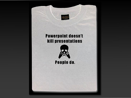
In a recent discussion with a colleague, I voiced the opinion that the challenge of creating presentation software is to enable terrible presentations – zooming animations, tiny and unreadable text, endless bullet-points. Helping people create good presentations? That would be easy.
Really, you could do it with some nice, full-screen image viewing software.
He disagreed, arguing that there was no point in having slides at all if there was nothing on them. Mostly, I think, that he wanted to think that he gives good presentations. And he uses slides covered in bullet points.
My main point was that you can give a terrible presentation even with beautiful, minimalist slides. But that people rarely do, and that things about the discipline of minimalist slides, means that more effort goes in, the flow is thought out better, and this typically results in a better presentation.
Between now and then, I saw someone present. And I thought – I need to rethink this view on things, because this guy is giving a good presentation… and he has some of the ugliest slides I’ve ever seen.
But actually, I think this presenter is a good speaker, passionate and knowledgable about their subject, but their presentation itself could use some work. I think that improvements would flow from making more beautiful slides.
- Structure. When you pare down your slide deck to the minimum, the structure of your talk is more apparent. If you’re making one main point per slide, then it’s easier to see if it’s balanced – you’re won’t have 10 slides for something relatively unimportant. Somehow, it’s easier for 10 bullet points on one slide to slip past…
- Flow. Does your talk tell a compelling story? Similarly to structure, it’s easier to see this when your content is pared down. Something that is off-topic becomes obvious.
- Key points. Because my slides are minimal, I think very carefully about any text I put on them. Sometimes it’s helpful. But when you have text-heavy slides already, that really important piece of text gets lost. And, if you read it aloud because it’s so important then it seems like you’ve drifted into reading your terrible slides.
- Preparation. You can’t get away with putting chunks of your last paper/blog post/whatever into a deck and presenting it if you go minimalist. You have to spend the time to make a beautiful deck. Starting from scratch like that means you need to know what you want to say. Picking the right images takes time and means you need to know what your point is. I confess that sometimes I use slightly random images in my decks, but what I’ve noticed is that people read into them what they want to (e.g. someone thought the penguins in my ignite deck represented conformity).
- Attention. Everyone knows that when there is text on screen, people read it. When they are reading it, they are not listening to you! You make less sense after a few minutes of distraction than if the audiences attention was on you all along.
- Tempo. The thing about text on slides, is that the audience can tell when you skip over bits to work with the time available. Presenters even mention that “there are three things here, really, but I’m just going to talk about one”. When each slide is for a main point, rather than a set of bullet points, you have more flexibility in your tempo. I once gave a talk that was scheduled for 45 minutes, but then due to people being late was cut to less than 30. Part way through, they changed it back to 45 (for real, it was chaos). Because each slide was a point or story that I knew well and was passionate to share, it was easier to leave out detail when I thought I had little time, and then add it back in (and more) when the time went back up. Could the audience tell? Probably. But it would have been much harder for me to be flexible and carry this off if everything I planned on saying was right up there on every slide.
- Translation. Most people don’t present in multiple languages, although if you do, not having to translate all that text is an excellent reason not to have it. But, this also applies to different audiences. I gave fundamentally the same presentation to high school kids and to adults at completely different venues. Both were well received. I kept the structure and the deck the same, whilst changing my wording, emphasis, and the stories I chose to share. By not publicly committing to what you’re going to say, you have the flexibility to be responsive to the audience.

4 replies on “How To Give A Terrible Presentation”
Number 2, flow, is one that so many  people take for granted, and is fundamental to a successful presentation. You need to have a natural pace, a narrative, that is continuous throughout.Â
You can give an entertaining presentation without flow, but you cannot give an effective one, i.e., a presentation that leaves people with the knowledge that you hoped to give them.
Yes – I think those are the speakers that you enjoy at the time but afterwards find yourself thinking, “but what did they *say*” – coherent flow makes the main points stand out, and the resulting thing more memorable.
Really useful .. thanks.
Really useful .. thanks.